PROJECT ONE
The third time is the charm:-)
Here are the first fruits of the last rotation of our school year. This first project showcases close-up portraits. Students were encouraged to show only what they wanted to show of themselves, with explanation for the viewers.
Additionally, there are grand plans for this rotation. Please be on the look-up for updates on my events page, where further information will be posted about our show planned for May 8 in conjunction with all of the other fine arts...
For now enjoy the our journey...
Behind the Picture
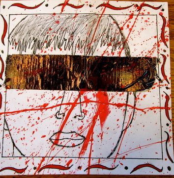
Art tells stories. They might not be loud, verbal, or ecstatic but they are there. In my self portrait I also tell stories. I tell my stories through poses, materials, or even hidden messages in my art. My idea was see no evil. It expresses blindness to violence and explicitness surrounding oneself. I explain my idea through two main ways the tape over the eyes and the red paint splatters.
My first idea was the tape. The tape represent blindness. It tells the story of someone who chooses not to see problems surrounding them. This is the “seeing” part of see no evil. The tape is duct tape which can also represent censorship of truth. This means that not all problems are being revealed. Overall the tape is a major component of my picture and my story.
The second way I showed my idea was the paint splatters. They tell the story of violence and explicitness surrounding people. The tape adds to this effect by making the colors pop out. The portrait is black and white so when the red splatters are added it makes the picture pop. Overall the color scheme and the story help intensify and add meaning in the portrait.
These ideas and concepts come together to form an expressive portrait. It tells a story through art that is personal to me. That’s what my portrait is.
13-Up
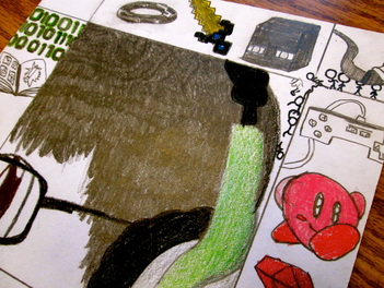
These few weeks in art, our class has been working on self portraits, drawn by hand. I was very excited for this project, as I work on art projects at home, and due to my knowledge of the pencil and the pen, I finished mine of high quality in a week. My drawing was supposed to represent my original drawing style and the life of a teenager. I’ve always enjoyed the scratch of pencil on paper, and slowly over time, created my own drawing style. I wished to express that in my caricature. Furthermore, around our picture, we had to draw a frame to match the theme of the picture itself, so I decided to incorporate my thoughts and likes into my frame, trying to express my individuality as much as I possibly could. A few items that made an appearance were Minecraft, Tron, video games, and music. I really enjoyed this project, because it challenged me to think and draw with limited materials on my hands, as what I am used to. My drawing style is different then everybody else’s simply because I based mine off of an old cartoon show, called Kirby: Right Back At Ya!™. I drew myself based off of a character template, as I enjoyed that show growing up, and it changed how I saw the world and reacted with art. One day, I want to incorporate my ideals and drawing styles into being an animator or a graphic designer for a video game company, and make my own little dent in the world of art.
These few weeks in art, our class has been working on self portraits, drawn by hand. I was very excited for this project, as I work on art projects at home, and due to my knowledge of the pencil and the pen, I finished mine of high quality in a week. My drawing was supposed to represent my original drawing style and the life of a teenager. I’ve always enjoyed the scratch of pencil on paper, and slowly over time, created my own drawing style. I wished to express that in my caricature. Furthermore, around our picture, we had to draw a frame to match the theme of the picture itself, so I decided to incorporate my thoughts and likes into my frame, trying to express my individuality as much as I possibly could. A few items that made an appearance were Minecraft, Tron, video games, and music. I really enjoyed this project, because it challenged me to think and draw with limited materials on my hands, as what I am used to. My drawing style is different then everybody else’s simply because I based mine off of an old cartoon show, called Kirby: Right Back At Ya!™. I drew myself based off of a character template, as I enjoyed that show growing up, and it changed how I saw the world and reacted with art. One day, I want to incorporate my ideals and drawing styles into being an animator or a graphic designer for a video game company, and make my own little dent in the world of art.
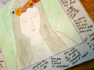
I wanted my self portrait to reflect something that is important to me. Music is one of those things. So I wrote some of my favorite lyrics from my favorite songs all around my frame. My favorite bands are Panic! At The Disco and Fall Out Boy, so I made sure to include plenty of song lyrics by then. I colored in my frame with purple colored pencil and my background with light green, because those are two of my favorite colors. I drew my face in plain gray pencil because I wanted it to mostly be simple, but it can also reflect the quieter aspect of my personality. I love flowers, so I cut out some from a magazine and arranged them in a crown on my head. This can reflect the more colorful aspect of my personality.
Basically, I want people to be able to take away a few things from looking at my self portrait. I want them to know that music, and those lyrics in particular, are important to me. Even if they do not recognize the songs, I hope they know that they have meaning to me. I want people to take away that I can be a quiet, shy person at times but also a happy, carefree person at other times. This is what I am trying to say with my self portrait.
Basically, I want people to be able to take away a few things from looking at my self portrait. I want them to know that music, and those lyrics in particular, are important to me. Even if they do not recognize the songs, I hope they know that they have meaning to me. I want people to take away that I can be a quiet, shy person at times but also a happy, carefree person at other times. This is what I am trying to say with my self portrait.
Reflection
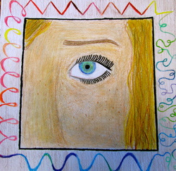
In my portrait, I drew a close up of my face, with the main focus on my eye. I drew my natural skin color, hair color, and eye color because I wanted my portrait to be as realistic as possible. For my frame, I drew a long line around the circumference of the portrait. The line reflected all the different moods a person could have, including happiness, sadness, anger, confusion, or vulnerability. The line, almost ribbon like, had loops, zig zags, and curvy lines.
The purpose of drawing the portrait was to express all the different moods a person could have, and the only way you can really know how they are feeling is by the look in their eyes. Eyes almost give a direct reflection of exactly how the person is feeling. They can show true love, true hate, true anger, or true insecurity. So when a person may seem happy, they could be just about ready to cry on the inside. That was the reason I put my main focus of the portrait on my eye, to put more emphasis on the message.
I want the viewers of my portrait to leave realizing that people sometimes don’t pay much attention to the key clues of someone and how they are truly feeling. Just because you see her smile, or you see him laugh, doesn’t mean they are 100% happy. The only way you can tell how they are actually feeling is by the look in their eyes. Eyes are the only part of your body that cannot lie. As I saw quoted from an anonymous writer, “Realize, real eyes, real lies.”
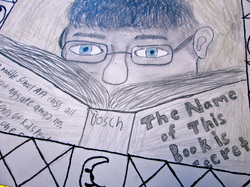
Rationale behind My Art
The rationale behind my art has several parts: hiding, intelligence, balance, and love of books. The book in front of my shaded face is a metaphor for hiding in books. The piercing blue eyes -- that aren’t shaded like the rest of the face--symbolize intelligence. The clear eyes are also a way of showing that I can see out of the shadows. The title of the book has to do with secrets and hiding, and I thought it was appropriate for the piece. The blurb was something that I wrote on the back of the book for a little bit of humor in the artwork.
The rest of the art around the outside of the piece also had a rationale behind it. The brown background is a neutral background that doesn’t distract from the rest of the art. The symbols around the outside are signs that balance nicely. The sun and moon and the yin yang symbols are all signs of balance, and they represent inner balance. I chose this pose because I like books and I like reading. This pose shows my face and my book, which represent my good looks and my love of reading. The diamonds in the border are a way to make the border look more interesting. On my sketch, the diamonds were the best looking part of the border, so I kept them in the final piece. These elements of hiding, intelligence, balance, and love of books represent me.
PROJECT TWO
This project's inspiration came from the works of Robert Longfield - "Turning Point". The students were told to focus upon "the journey" as they tackled "perspective" concepts. Explore the various moods, textures, and colors produced by your children as you listen to the music - via the you-tube link under the slide presentation.
PROJECT THREE
Students had the opportunity to reflect upon the theme music from "Schindler's List" for this project. Students were encouraged to consider the Principles of Design - mood, movement, balance and more in the creation of these works. A shorten you-tube rendition is available under this presentation.
Remember all these works and others not included here, will be shown at the arts integration show on May 8 at 6:30 at Nichols Middle School.
Remember all these works and others not included here, will be shown at the arts integration show on May 8 at 6:30 at Nichols Middle School.
